

The 15 best ‘About Us’ & ‘About Me’ pages and how to create them yourself
In many ways, building a website is an exercise of willpower. It’s tempting to get distracted by the bells and whistles of the design process and forget all about creating engaging content. It is that compelling content that is crucial to making inbound marketing work for your business.
So how do you balance your remarkable content creation with your web design needs? It all starts with the “About Us” page.
For a remarkable page, all you have to do is figure out your company’s unique identity and then share it with the world. Easy, right? Of course not. Your “About Us” page is one of the most important pages on your website and should be done right. This profile is also one of the most overlooked pages, which is why you should notice it.

The good news? It can be done. There are even some companies with remarkable “about us” pages, whose elements you can emulate on your own Web site.
By the end of this blog, you will know what makes some of today’s best “About Us” and “About Me” pages so great and how you can create your own page that shares the greatness of your business.
Best “about us” page examples
- Yellow Leaf Hammocks
- Eight Hour Day
- Joe Payton
- Apptopia
- Moz
- Aja Frost
- Cultivated White
- Kero One
- Nike
- Refinery29
- Sara Dietschy
- Marie Catribs
- Marc Ensign
- Bulldog Skincare
- Doomtree
1. Yellow Leaf Hammocks
Why the “About Us” page is so good: It tells us a story.
If you have a good story about how your product or service is built to change lives, share it. The About Us page is also a great place to live. Good stories humanize your brand and provide context and meaning for your product. Moreover, good stories are sticky – meaning people are more likely to connect with them and pass them on.

Yellow Leaf Hammocks or Yellow Leaf Hammocks tell users about the product by describing how the hammocks support artisan weavers and their families. The company breaks down different parts of the story into sections combining words and easily digestible images, painting a picture instead of large pieces of text. They are clear why they are different: “Not a Charity,” the page reads. And then, “This is the foundation for a better future, built on a hand up, not a hand out.”
Every business has a story to tell, so break out your storytelling from that random English class you created years ago and put them to work on your “About Us” page. Using descriptive and emotional copy and beautiful graphics, an “About Us” page with a story works harder for your business than a generic one.
2. Eight Hour Day
Why the About Us page is so good: It’s human.
People tend to think that “About Us” pages must be accurate to gain credibility and trust. But most people find it easier to trust real people, rather than a description that looks like it came from an automaton. Trying to sound too professional on your “About Us” page results in stiff, “safe” copy and design – the perfect way to ensure that your business fits seamlessly with the masses.

Instead, Eight Hour Day showcases the people behind the company and humanizes its brand. By introducing the founders by name and showing their photos on the “About Us” page, they get to the point that Nathan and Katie – as they so cleverly put it – are two individuals with a passion for creativity – creativity makes us happy.”
When designing your “About Us” page, avoid industry jargon and replace it with an authentic voice – yours – to describe your product or service. Of course, it should be polished and error-free, but it should always sound friendly and genuine.
3. Joe Payton
Why the “About Me” page is so good: It’s confident, creative and easy to skim.
“About Us” pages can include the values of more than one person or entity, but they are no more important to a company’s image than your personal page. Take Joe Payton’s “About Me” page.
Not only does Joe’s illustrative self-portrait give him a personal brand that customers will remember, but it also showcases his expertise as a designer and animator. His website visitors can learn not only what he does, but why he does it, in an easily digestible way. Being able to express his values as a creative professional on such a well-organized page is something to wish for when someone creates his own page.
4. Apptopia
Why the About Us page is so good: It skips the business talk.
We know – no jargon. If you think you sound super smart on your “About Us” page, think again. People want and appreciate talking directly about what your company does. After all, if people don’t know what you do, how do they know they need your product or service?

So skip the industry fears – that’s what Apptopia does on its “About Us” page. The startup’s simple but polished language effectively communicates the company’s offerings while still making Average Joe understand.
The moral of the story: try to remove as much jargon as possible on your “About Us” page. Use short and snappy sentences to explain complex products and ideas in a way that is not patronizing, but rather empathetic.
5. Moz
Why the “About Us” page is so good: It’s humble.
Instead of following the classic “About Us” script and writing a few paragraphs about the company’s mission and origins, try something different: There are plenty of ways to make your brand more appealing to someone who knows nothing about you.
Take Moz, for example. A lot has happened since its founding in 2004, so the company chose to share those milestones with a fun and clean design that features bright headlines, concise blurbs and small graphics to break up the text.
We especially love the humble references to how Moz received funding, how it changed its brand positioning – and more importantly, how it switched back to its original model. This speaks volumes about the value that honesty and modesty can play to your customers. Don’t be afraid to talk about your ups and downs; your customers will be much more likely to trust what you say.
6. Aja Frost
Why the “About Me” page is so good: It’s data-based.

As a data-driven professional, Aja knows that as a freelance writer and strategist, her own clients not only want to see what she has written – they want to see how her content has performed. With that in mind, her “About Me” page tells a story of her career growth, peaking – and no pun intended – at an impressive line graph showing the result of an SEO strategy she often implements.
After the impressive graphic, Aja closes her about page with a personal note about what she does in her spare time – always a good way to humanize yourself in the eyes of your potential clients.
7. Cultivated White
Why the About Us page is so good: It breaks the mold.
That’s exactly what Cultivated Wit – a creative agency and media company – does, with both an edgy name and an incredibly fun story told through video and parallax scrolling … right on the home page.
Even if you have a dedicated “About Us” page, there are plenty of ways to creatively make your company’s personality visible throughout your website. And yes, that’s harder than filling a stock “About Us” template – but it can pay significant dividends for your brand.
8. Kero One
Why the “About Me” page is so good: It’s multilingual.
Kero One is a hip-hop artist and DJ from San Francisco, and his About Me page offers a valuable lesson to personal brands targeting more than one audience – especially if those audiences speak different languages.
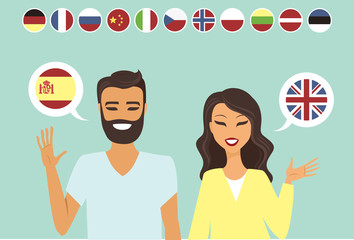
Kero One’s story begins on his childhood, when he was six years old and first discovered a passion for hip-hop. Knowing how old and genuine his love for the genre is adds tremendous value to his own music in the eyes of his listeners.
While this entrepreneur’s interests help youth deepen his audience, the measurability he employs helps expand Kero One. His “About Me” page tells his story first in English, then in Japanese, then in Korean and then in Chinese. Accommodating this Southeast Asian audience makes his brand more inclusive of all audiences he identifies with.
9. Nike
Why the About Us page is so good: It knows its audience.
Nike may seem like a company too big to inspire smaller companies. You might even wonder if Nike still has an “About Us” page. In fact, it did, and the company has not forgotten its roots.
Nike began on the University of Oregon campus by the hand of the college’s coach, Bill Bowerman. And although he no longer works at the company, one of his beloved quotes is still the low point of Nike’s “About Us” page: “If you have a body, you are an athlete.”
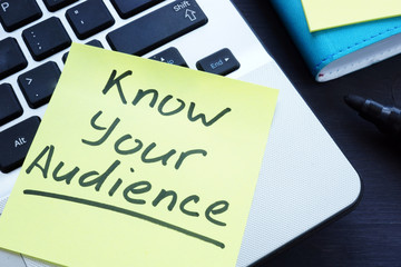
This bold phrase, to which the asterisked “Athlete” refers in the words directly above it, sheds important light on Nike’s audience. The brand may be big today, but Nike is all about its rising stars – on whom Nike depends, according to the rest of the “About Us” page,” expanding the human potential.
The takeaway for marketers? Know your audience and make it obvious to that audience the moment they read about you on your website.
10. Refinery29
Why the “About Us” page is so good: It tells you what’s most important.
Here’s another example where part of your website – not just the “About Us” page – is an opportunity to break the margin.
Many companies just add a simple mission statement or company profile, but people often don’t want to create a wall of text explaining what you do. So Refinery29 broke it up to convey the elusive features that are difficult to include in a simple “About Us” page.
Although Refinery29 introduces its page with a description of its activities, it goes out on a limb. The organization has a “mission,” but there is also an “essence” of Refinery29, a “promise” it keeps and a “vibe” it spreads.
These are not business features that you would think they would consider at the outset, but these are the things that your customers often decide on when they buy.
11. Sara Dietschy
Why the “About Me” page is so good: It has variety but still matches her personal brand.
This professional YouTube content creator has a collection of videos related to technology and culture and displays that diversity on her “About Me” page.
In addition to the vivid self-portrait at the top of the page, Sara’s first sentence tells how many people subscribe to her channel: 350,000. This is an important number to know for her potential video advertisers and contributors who want to know how much exposure they will get by working with her or advertising on her channel.
The colored tiles along the page – starting with the red, also do a great job segmenting her work based on the types of projects she takes on and for whom she has done them. That Intel logo in another photo of Sara, is sure to turn some visitors upside down while viewing her website.
12. Marie Catribs
Why the “About Us” page is so good: It’s unexpected.
There is a reason why these examples are exceptional – “About Us” pages are not always the most engaging parts of a company’s Web site. Indeed, they often look like an afterthought. But even if you don’t have a budget for juicy graphics, videos or parallax scrolling, there are other ways to make your “About Us” page unexpected with copy alone.
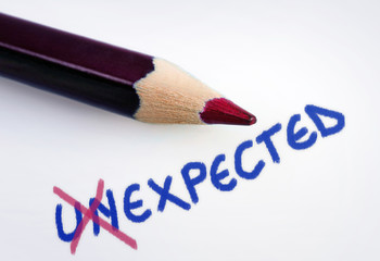
Marie Catrib’s is a restaurant, so you might think their “About Us” page is your typical “here’s how we started, here’s what we believe in, and here’s our food” story. Marie Catrib’s “About Us” page tells us just that – but it does so in an unconventional way. Immediately the user’s eyes are drawn to a headline that says, “It’s fine to make a mess, experiments can lead to beautiful things.” Very philosophical, for a place to dine.
But then comes the story about the owner, which begins in an unexpected way: “It’s hard to imagine, but all at once Marie was banished from the family kitchen.” Such a line attracts the public because we know it will not be typical.
So, how do you use it to really attract readers? It’s amazing the impression you can make on site visitors by creatively telling your story with words alone.
13. Marc Ensign
Why the “About Me” page is so good: It’s funny but professional.
This brand expert does two things super well on his page: he takes his work seriously, but doesn’t take himself too seriously. Marketers know the value of keeping a loose tone in the content they create, but to attract customers, you have to prove you have discipline and integrity. That’s a difficult balance to get right.

Marc Ensign manages to strike that balance between friendly and formal with a confident opening line followed by a funny smiley picture of himself to set an inviting tone.
14. Bulldog Skincare
Why the About Us page is so good: It’s sweet and memorable.
What is the difference between “average” marketing and amiable marketing? It’s the difference between creating generic Web pages that offer great information, but in a simple, black-and-white way — versus creating Web pages that offer great information and are infused with color, personality and stay true to a company’s unique brand voice. When you create loving marketing, you can start a movement of brand evangelists and advocates that will help you grow.
Where does this fit into a company’s “About Us” page? The folks at Bulldog, a men’s skincare product company named after the informal “man’s best friend” – a dog – could have penned a few paragraphs about where the brand came from and how they were one of the first in the space to redefine and eliminate stereotypes around men’s grooming. But that text alone would have been a bit average.
Instead, the “About Us” page is snappy, colorful and leads with the amiable mug of an adorable bulldog – befitting the name and brand. And it states the purpose of the products – to help customers wake up to the (admittedly cute) wrinkly face you see when you visit the Bulldog website.
Play on your own words – it’s okay to have fun and use your own word because it helps inject personality and humor into your About Us page. It primes visitors for a story in a way that makes them feel something immediately. That’s how you create memorable, sweet marketing.
15. Doom Tree
Why the About Us page is so good: it shows, tells and has a soundtrack.
One minute of video footage is worth 1.8 million words, according to Forrester Research’s Dr. James McQuivey. But what about audio and visuals, all combined with a really cool story? Well, that’s one way to tell your story in an engaging way – through multimedia.

Doomtree is built on a bit of an innovative concept: that a group of talented artists can each have thriving careers as soloists, but still get together regularly to make great music. It’s not a band – it’s a crew. It’s an unconventional concept with an equally interesting backstory that “began as a mess of friends in Minneapolis, joking around after school, trying to make music without reading the manual.” And as soon as you arrive at Doomtree’s About Us page, you are greeted with big, bold photos of those friends.
As you scroll down, users are treated to even more interaction with crew tracks and music videos. This makes sense because it immediately gives visitors an example of Doomtree’s product. In addition, the entire “About Us” page is responsive, including the video. This is important – not only because it offers site visitors a great mobile experience, but also for Google search results – especially now that such mobile usage has surpassed desktop.
How do you write an “about us” page?
- Create a mission statement.
- Outline our company story.
- Reveal how you have evolved.
- Enter your “aha!” moment.
- Explain who you are serving.
- Explain what you are offering them.
- List examples of who you have served.
- Describe your values.
It is difficult to establish one comprehensive template for your “About Us” page – there are so many ways you can tell your company’s story. But on the real “About Us” pages we just highlighted, there are some steps to keep in mind as you get started.
Here are eight steps to writing an “About Us” page based on some of the things that impressed us about the examples above.
1. Create a mission statement.
Your “About Us” page can and will be much longer than a single mission statement, but to get people involved, briefly critique your purpose up front. What are you doing here? Why should visitors to your website care about you?
2. Bring an overview of your company’s story.
You may not have a long history of changes and growth that your business has endured (yet), but it’s a nice idea to tell where you came from in your “About Us” page. So isolate the milestones prior to the founding of your company and use them to give readers a backstory about your current venture.
3. Reveal how you have evolved.
Even if you’re a young company, there’s no shame in admitting that your business strategy — or even a personal way of thinking — has changed since you started. In fact, on about pages, these evolutions can enhance the story you tell website visitors.
About pages are perfect places to talk about where you started, how you grew and the ideals that helped your organization mature. Use these moments to promote your company story and show people that you are always ready to change and adapt to the needs of your industry.
4. Give your “aha!” moment.
Every good business is based on an idea – something the current market may not yet offer. What was your idea? Use this “Aha!” moment as a pivotal point when telling your company’s story. What was a challenge for you while developing your business? How did this challenge or discovery shape what you are today?
5. Explain who you are serving.
As many as you want, as many eyes on your “About Us” page as possible, you will not do business with each of them. Therefore, it is critical that you identify and mention your core customer. Who should care about you? What eyeballs are you here to serve?
6. Explain what you are offering them.
While explaining who you are serving, make it clear what you are offering. Too often, companies generalize their products or services in the language of their Web site, making it difficult to understand what the customer is actually paying for. They fear that literal explanations of their products will not be interesting enough, or will sound unappealing. And that’s a fair concern.
If you invest just one or two sentences in telling your potential customers exactly what they will receive, they may stay on your website longer and be more interested in learning more.
7. List examples of who you have served.
Do you have some loyal clients in your portfolio? Use your personal page to let the world know who already trusts and benefits from your work.
Knowing your company’s past success can influence the buying decision of up to 90% of today’s B2B customers, according to Dimensional Research. Even if you do not yet have case studies to expand on the problems you helped buyers solve, it is in your best interest to briefly mention for whom you have done so. And your page is the perfect platform for that.
8. Describe your values.
Customers want to be treated like human beings. For that to happen, they must feel they are being treated by people. When you finish your “About Us” page, describe who you are as a person or team and what your personal values are. What does your corporate culture look like? What larger picture in life drives your business?
Keep in mind that a secondary audience of your company’s About Us page consists of your future employees. This is another reason why describing your personal values is a good idea – the key to winning the hearts of your applicants is to show that you have one too.
At this point, we hope creating an “About Us” page doesn’t seem like a daunting task, but we hope you’re ready to have some fun with it. With good storytelling, creative copy, humility and digestible visuals, you are on your way to an eye-catching user experience.


